Reports are graphic visual representations of data, which is intended to present insights quickly and clearly. OvalEdge has a lightweight in-built visualization application that allows users to build basic reports. A user can make a quick search using a specific report name to understand the lineage of the data used in the visual.
All the reports or dashboards can be viewed in the All Reports page. Specific reports can be added to the user's personal space for quick access, by subscribing to a selected report.
Process to create custom reports
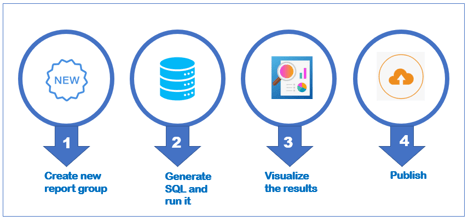
To create a custom report, we need to follow four steps:
- Create a new report group
- Generate SQL and run it
- Visualize the report
- Publish it
 Let us see the steps in creating the custom reports below.
1. Create new report group
The Report group is simply a group of Reports. Multiple Charts and dashboards can be grouped under a single Reports group to easily manage its security permissions. Before granting a user role to access reports within a particular reports group, the user role has to be given Metadata and data access rights to the corresponding attributes of data objects (Example: database/ table/ column) for that report. Administrators can provide access to the whole Report group.
There are two ways in creating charts and dashboards.
- OvalEdge_Reports - Reports created within OvalEdge
- BI tools - Reports/ Dashboards created using Business Intelligence tools
Example: POWER BI/ TABLEAU
For reports and dashboards created in BI tools
For reports and dashboards that are created in other Business Intelligence tools, a Report group is automatically created. When a user crawls a schema/site/app workspace, all the reports and dashboards from that schema are created automatically as one reports group.
Example: When a User crawls an app workspace (OvalSampleSql) from Power BI, a new reports group called OvalSampleSql is created in the security page all the reports and dashboards within that schema are created as a single Reports Group.
How to create new report group?
- Expand the Administration tab in the object browser and select Security.
- Select the Reports Groups tab from the security menu bar and click "+" to Add a new Reports Group.
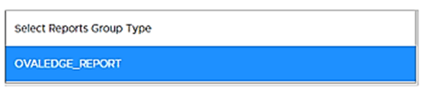
- Select OvalEdge_Report from the reports group type list menu.
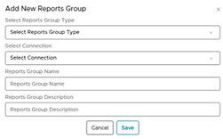
- Select the Connection.
The connection is the database name associated with the report. Choose from the drop-down list. - Enter the group name and description for the reports group. Click Save to save the Reports group name.
Note: You can perform actions such as update roles, update owner and steward on a Report group the same way it is done on databases.
2. Generate SQL and run it
In order to generate custom reports for your Data, open Query Sheet and run a query for which connection you want to generate a report.
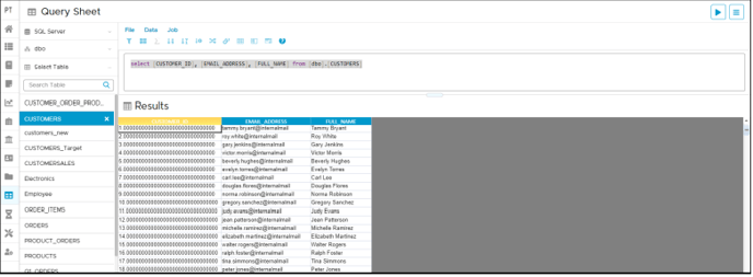
All the queries executed in the query editor are recorded as historic queries. A user can simply view the latest query executed and save the query by selecting the catalog button. Additionally, a user can view the results of the historic queries by clicking the view result icon on this page.
See this article Query Sheet to know more about generating and running a SQL.
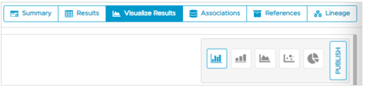
3. Visualizing the results
OvalEdge offers a lightweight visualization feature that allows users to quickly see their data in a graphical form. In OvalEdge, you can visualize your saved queries as basic charts like bar charts, line graphs, area charts, scatter plots, and pie charts. The charts are then published to the OvalEdge timeline dashboard. For information on how to build charts, please refer to Visualizing the Query Results.
The data results can be visualized graphically in this window as shown below:
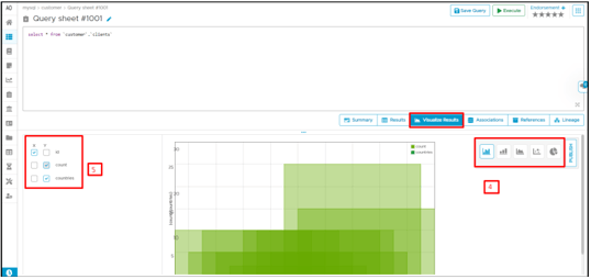
To build a visual from a cataloged Query,
- Select the Query from the Data catalog >> Query tab. This will take you to the Query interface. Make changes to the query if any and click Execute to execute the query and see the results in the result window.
- Click the Visualize results tab to select from the available charts in OvalEdge. Choose a chart to represent your data in the x and y-axis.
- Select the corresponding columns to visualize results.
4. Publish the visual
Once the Query results are viewed in a graphical way, click publish to share and view the results in the All Reports dashboard.
- Click the Publish button.
A pop-up window allows the user to input the chart details.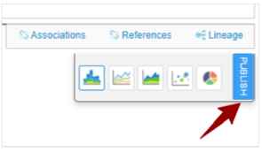
- Enter a report name, report description (report description allows users to get more detail about the chart).
- Select the Reports group from the drop-down list. If there is no report group listed, create a report group using Step-1: Creating new report group
- The Reports group is a user-defined group name where the selected report must be published.
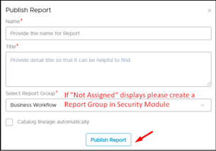
Click Publish report. Navigates to the All Reports dashboard to view the published chart.
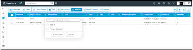
Alternatively, open Data Catalog → Reports and filter Report Group to view the published chart.
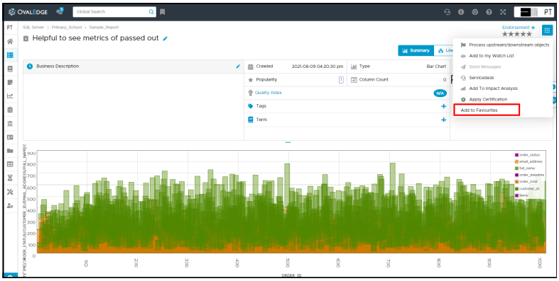
Users can add the Reports to Favourite Reports Dashboard from 9 dots.
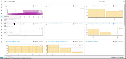
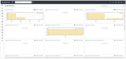
All Reports Dashboard
It is a single platform where users within an organization can publish their reports and dashboards and share them with others. A user can pin the most important and frequently viewed charts to their personal dashboard space for quick access.
 OvalEdge has the ability to interact with various visualization software like Tableau and PowerBI. The dashboards that are built in these business intelligence tools can be integrated and viewed in OvalEdge Timeline Dashboard. Advanced jobs are performed on these dashboards to build relationships and data lineage using algorithms.
Favourite Reports Dashboard
OvalEdge dashboard feature allows users to save important or frequently used dashboards in personal space for quick access using the ADD TO FAVOURITE.
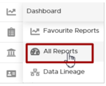
- Click the Dashboard tab from the object browser and choose All Reports.
All the charts built using OvalEdge visualizations are listed with a dashboard image preview. To view dashboards from other visualization tools like Tableau and Power BI, the user must connect with the BI tool and crawl the metadata. - Use the search option or scroll through the pages to find the chart. Set the toggle key to “Add to Favourite” and save the chart to Favourite dashboard space.
- Click Favourite dashboard to see the saved chart in the personal space.
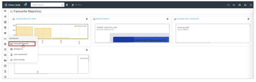
Note: To remove charts from the Favourite dashboard, click on delete option.
