Overview
The OvalEdge Dashboards is a valuable feature that helps users get a clear and easy-to-understand view of the curation work that has been done throughout the OvalEdge application. The OvalEdge Dashboards are a powerful tool that brings together various charts and important business insights on one screen, making it easier for users to see and understand the information they need to make smart decisions for their business.
The OvalEdge application makes it simple to turn data into charts like bar graphs, line graphs, and pie charts.
In OvalEdge, there are many system dashboards, each with its own purpose, like providing insights into data literacy, data quality, data quality scores, data lineage, and domain relationships.
Users can create, change, or delete their custom dashboards to fit their needs. System Dashboards can not be changed.
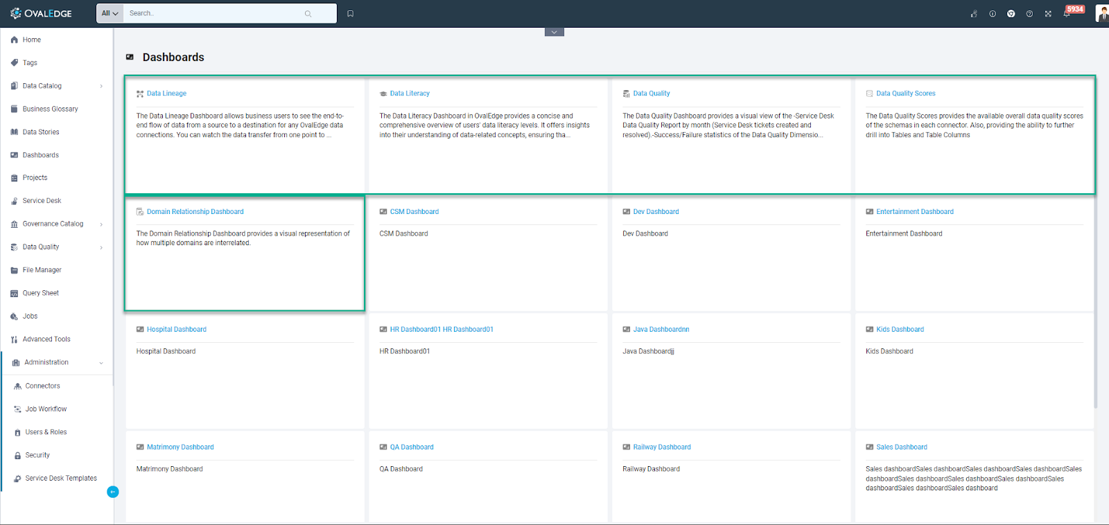
Users can navigate to the dashboard section quickly by clicking on “Dashboards” on the left menu bar. In this view, users can see dashboards as tiles with the name and description of the report.
Advanced Jobs to populate Dashboards
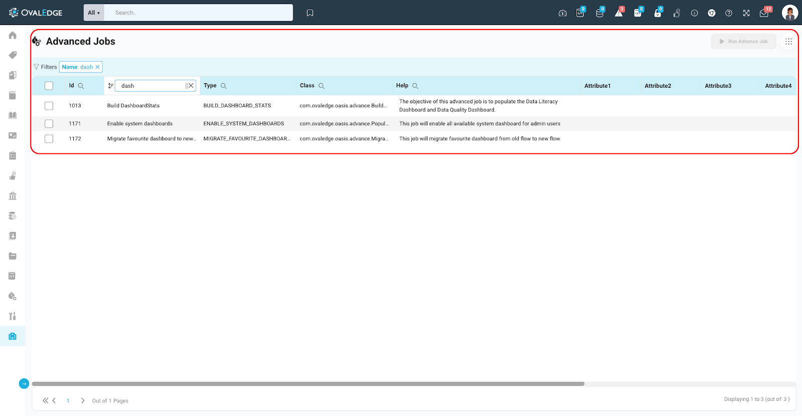
- Build DashboardStats: The "Build DashboardStats" is a sophisticated job designed to enhance the functionality of the Data Literacy Dashboard and Data Quality Dashboard. The primary responsibility is to refresh the reports featured in these dashboards. Unlike live data, these reports are initially stored in a staging table, ensuring that the information presented is accurate and up-to-date. Authorized users can trigger the refresh process by simply clicking the designated refresh button on the dashboard page. Upon activation, the "Build DashboardStats" job comes into play, executing the necessary operations to update the reports with the latest timestamp. This ensures that users consistently have access to the most recent and relevant data, promoting data accuracy and supporting informed decision-making within the dashboard environment.
- Enable System Dashboards: The "Enable System Dashboards" advanced job plays a crucial role in activating the system dashboards within the application. It holds the responsibility of ensuring that these essential dashboards are accessible to users. Without the successful execution of this advanced job, users will be unable to view the system dashboards. By running the "Enable System Dashboards" job, administrators or designated personnel initiate the process that makes these critical dashboards visible to users. This ensures that users can leverage the comprehensive insights and functionalities offered by the system dashboards to support effective monitoring, management, and decision-making within the application environment. The job serves as a pivotal step in enabling users to harness the full potential of the system dashboards for optimal system understanding and control.
- Migrate Favorite Dashboards to New Dashboard Flow: The "Migrate Favorite Dashboards to New Dashboard Flow" advanced job is a crucial component in the transition to a revamped dashboard experience. Its primary responsibility is to facilitate the generation of a new type of favorite dashboard, referred to as the user's dashboard. This job becomes essential due to the disparity between the previous version's favorite dashboard structure and the updated format. As the application evolves with a new dashboard flow, the "Migrate Favorite Dashboards" job acts as a bridge to seamlessly adapt existing preferences to the current dashboard framework. Authorized users can initiate this advanced job to rectify the discrepancy, ensuring that their favorite dashboards align with the updated design and functionality. This process guarantees a smooth transition for users, allowing them to effortlessly migrate and continue enjoying a personalized and optimized dashboard experience within the application.
System Dashboards
In OvalEdge, system dashboards are predefined dashboards that come with a set of reports ready for immediate use. These dashboards are designed to provide users with quick access to essential data insights and metrics without the need for extensive configuration or report creation.
The following system dashboards are available within OvalEdge:
Data Literacy Dashboard: This dashboard is tailored to enhance data comprehension and accessibility. It offers reports and visualizations to help users understand data terminology and concepts more effectively.
Data Quality Dashboard: The Data Quality Dashboard focuses on ensuring the quality and accuracy of data within the platform. It provides reports that highlight data quality issues, allowing users to monitor and address potential data inconsistencies.
Data Quality Scores Dashboard: This dashboard is dedicated to tracking and presenting data quality scores. It offers insights into the quality of data through various visualizations and reports, helping users identify areas that require attention.
Data Lineage Dashboard: The Data Lineage Dashboard offers a visual representation of data flow within OvalEdge. Users can explore the journey of data from its source to its destination, aiding in understanding data relationships and dependencies.
Domain Relationship Dashboard: This dashboard serves as a centralized repository for business-related terms and definitions. It helps users access and manage business glossary information, making it easier to align data with business terminology and objectives.
Features for Enhanced Data Governance:
- Refresh Button and Last Updated On Date: To ensure that data metrics are always up-to-date, users may use the refresh button in Data Literacy and Data Quality Dashboards. A simple click triggers an advanced job to automatically update the metrics, guaranteeing that users are working with the most current data insights.
- Dashboard Security: This security feature empowers users to control access to the Data Literacy Dashboard. OvalEdge Admin users can grant access to users with viewer access while retaining exclusive access to the refresh button. Viewers can explore the reports available within the dashboard, contributing to a more controlled and secure data literacy environment.
Custom Dashboards
The Custom Dashboards in OvalEdge provide a unique and powerful way for users to take control of their data management and analytics experience. This feature allows users to create and personalize their own dashboards, shaping report organization and categorizing reports through labels according to their specific needs.
Viewing Dashboards in Security
Users with “Author license” access can navigate to the Dashboard Tab in the security module.
Dashboards Tab in the Security Module
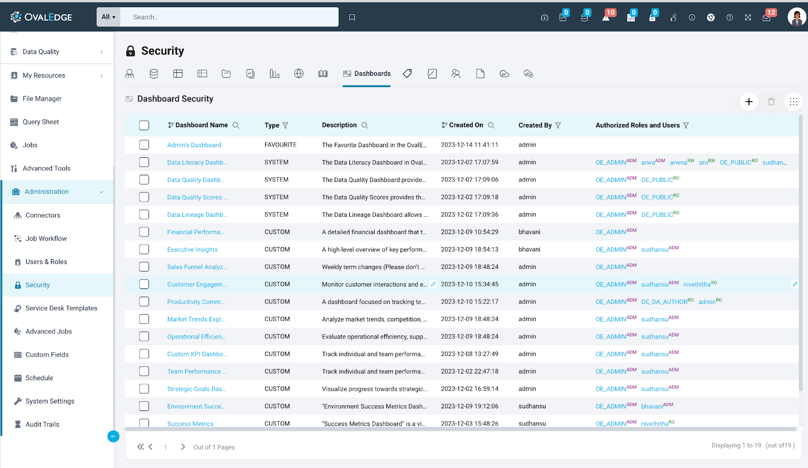
The Dashboards Tab in the Security Module is tailored for administrators, offering a robust suite of tools for effectively overseeing and securing dashboards. With Dashboards Security, administrators gain the authority to regulate access to both system and custom dashboards, allowing precise control over who can view, manage, and add reports to them. This ensures that data governance in your organization remains streamlined and perfectly aligned with your specific demands.
Users may navigate to the 'security' tab, to find a section where users can see all the dashboards.
- Dashboard Name (Sort & Search): This column shows the name of the dashboard, users can sort or search to find a specific one.
- Type (Filter): This column tells users what type of dashboard it is. There are three types: System, Custom, and Favorite. Users can use a filter to see only a certain type.
- Description (Search): This column gives users a short description of each dashboard. Users can search to find dashboards based on their descriptions.
- Created On (Sort & Search): This column shows when the dashboard was created. Users can sort the dashboards based on this, or search for dashboards created on a specific date.
- Created By (Filter): This column tells users who created the dashboard. Users can use a filter to see dashboards created by a specific user.
- Authorized Roles and Users (Filter): This column shows all the users, roles, and their permissions for a particular dashboard. Users can use a filter to see who has access to a specific dashboard and what they can do with it.
Adding a New Dashboard
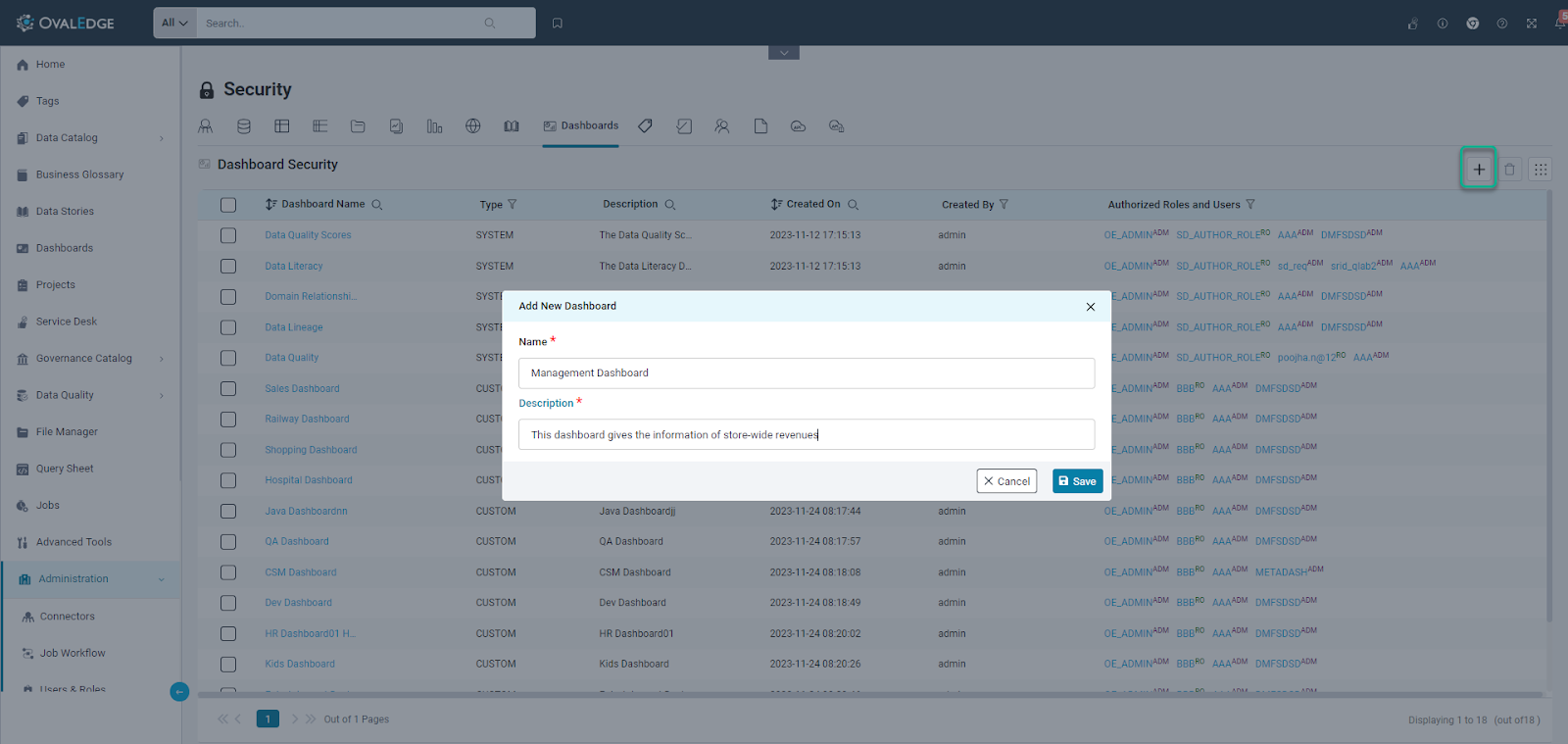
Within OvalEdge, users have the ability to craft personalized dashboards to suit their unique needs. This customization process involves the simple act of providing a title and description for their dashboard. Within the OvalEdge application, a custom dashboard can be created by navigating to the Administration > Security section from the left panel menu. Within the "Security" module, choose the "Dashboards" option from the top, available across the tabs. This dedicated section provides users with the features needed to both create and manage new custom dashboard effectively.
The mandatory inclusion of both a title and description ensures a comprehensive understanding of the dashboard's purpose and content. The title is limited to 255 characters, while users can delve into a more detailed description with a maximum of 10,000 characters. This thoughtful design allows our users to curate dashboards that are not only visually appealing but also richly informative, fostering a seamless and tailored data governance experience.
Edit Dashboard
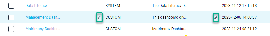
Within the OvalEdge user interface, users have the capability to modify their custom dashboards effortlessly.
When hovering over a specific dashboard, a discreet pencil icon becomes visible. By selecting this icon, users can promptly access and edit the title and description fields. This streamlined process allows for quick and precise adjustments to be made to dashboard content.
This functionality is intentionally designed to provide users with a professional and efficient means of maintaining their dashboards. Whether refining the title for clarity or enhancing the description with additional details, this feature facilitates a seamless editing experience. It is a testament to our commitment to empowering users with the tools needed to maintain polished and up-to-date dashboards within our platform.
Delete Dashboard
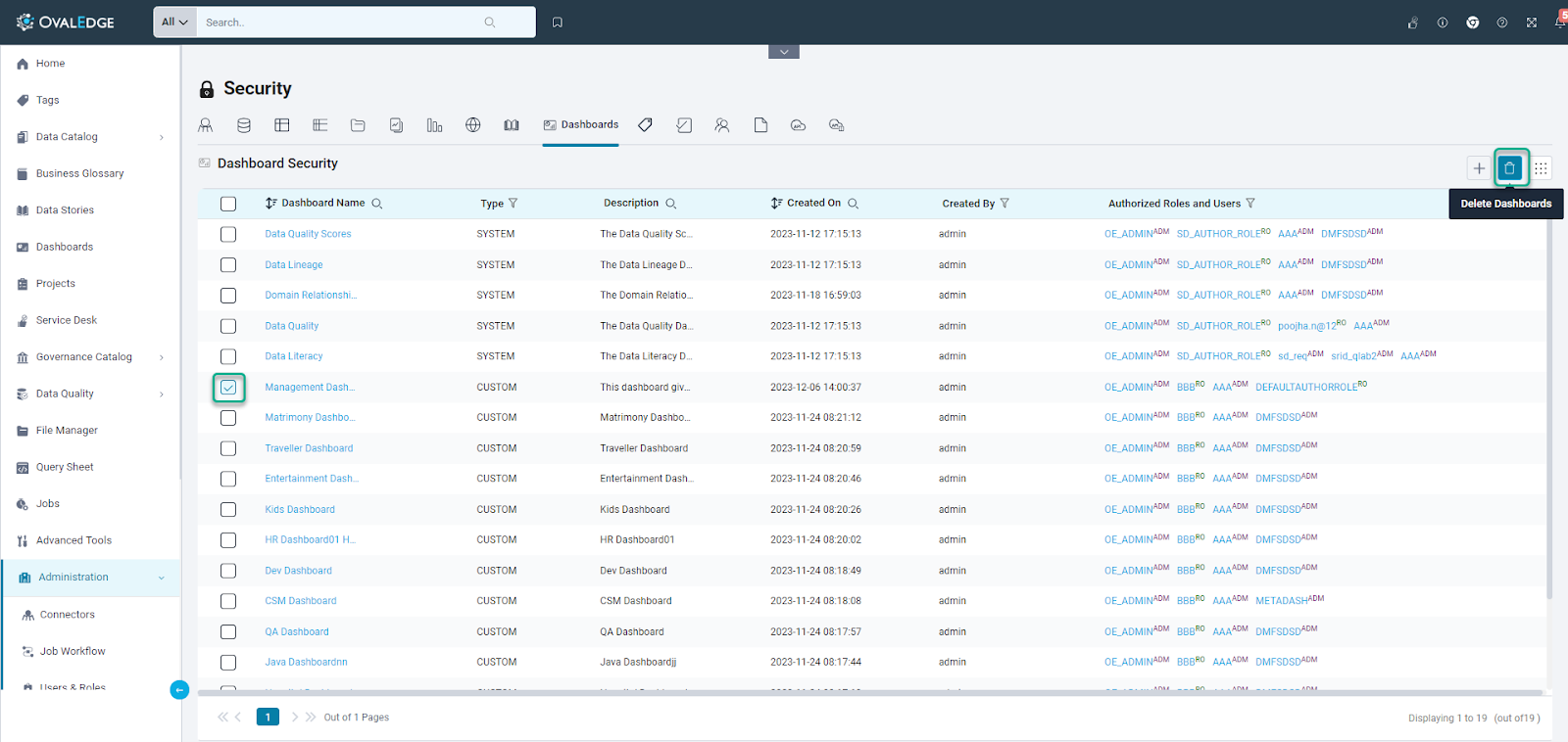
Users have the ability to streamline their dashboard management by deleting custom dashboards. This can be achieved through straightforward checkbox functionality. Users simply need to select the dashboards they wish to remove, and upon doing so, a trash icon conveniently positioned in the top-right corner becomes active.
By clicking on this trash icon, users initiate the deletion process for the selected dashboards. This intuitive and efficient approach ensures that users can declutter and organize their dashboard space effortlessly.
Managing Permissions on Dashboard
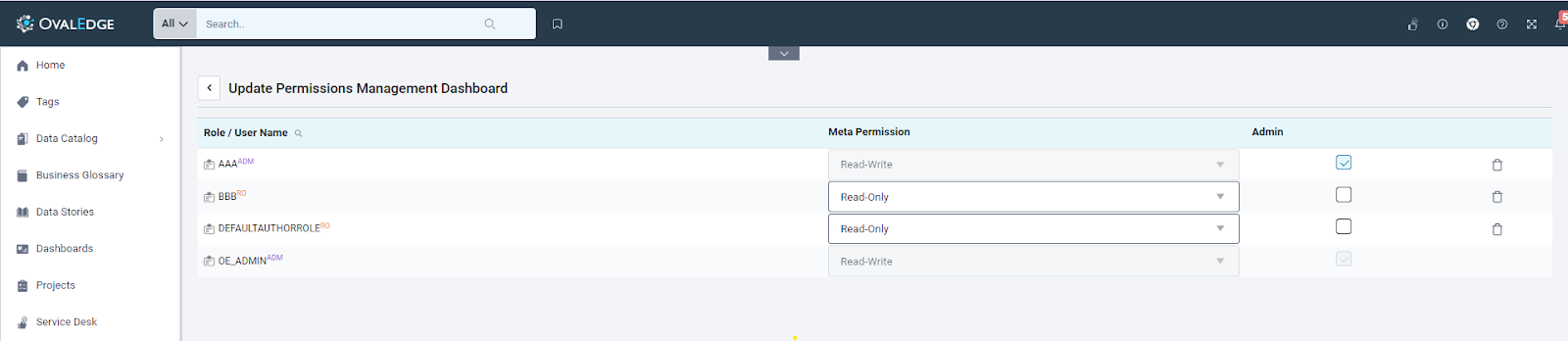
Within the OvalEdge platform, users hold the power to fine-tune the security settings, encompassing user access and roles, for each individual dashboard. This can be achieved by hovering over the desired dashboard; a pencil icon emerges, indicating the ability to configure security settings. Clicking on this icon allows users to adjust permissions and roles promptly.
For a more efficient management approach, users can also configure security settings in bulk for multiple dashboards. This is facilitated through a checkbox functionality, enabling users to select their preferred dashboards. By then clicking on the 9 dots, two options become available: "Update Permissions" and "Delete Roles." This streamlined process allows users to tailor security settings according to their specific needs, either individually or collectively, ensuring a comprehensive and user-centric security configuration experience.
Managing Reports on Custom Dashboard
Adding Reports to Dashboards
Users are empowered to enhance their custom dashboards by adding reports through three distinct methods:
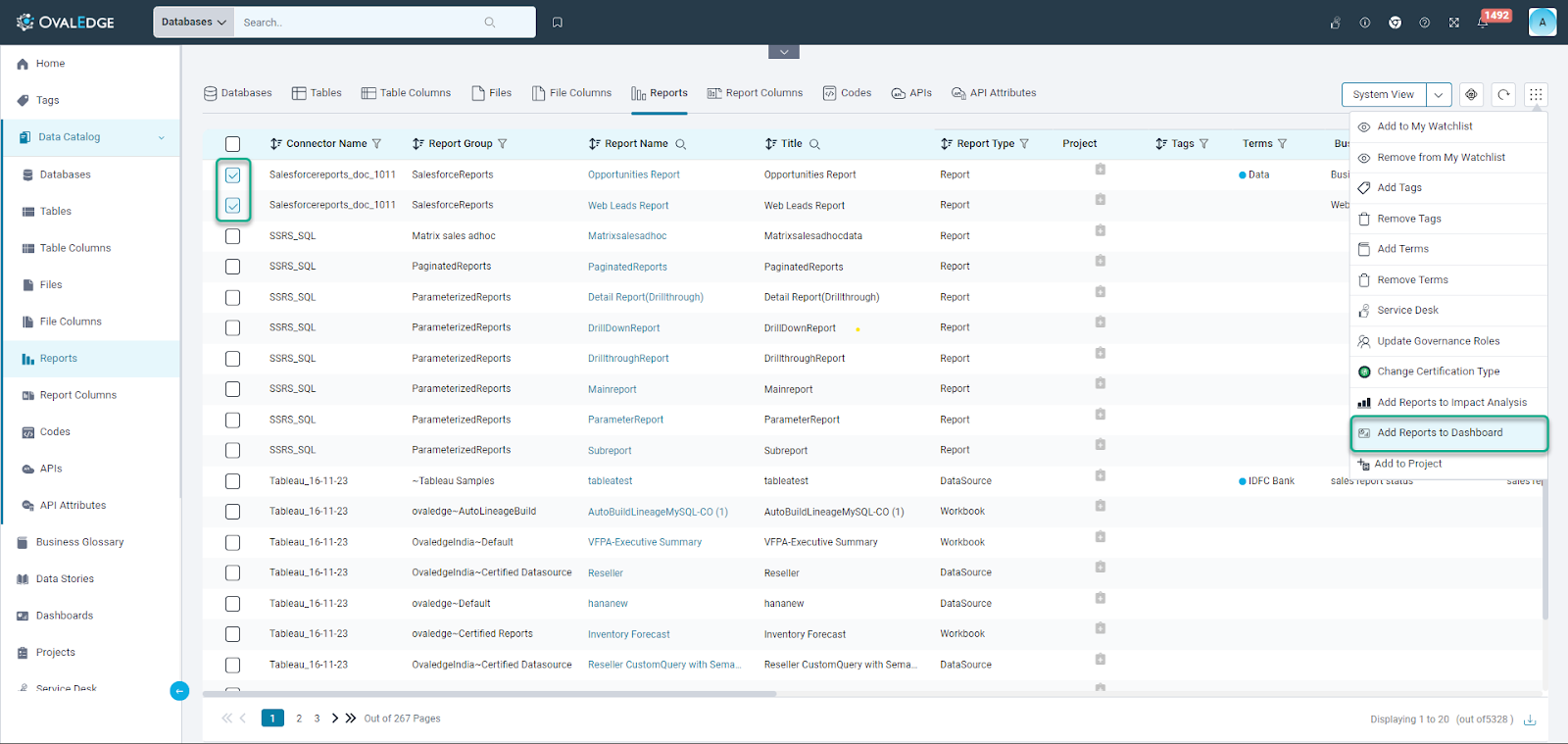
- Data Catalog > Reports (Summary Page)
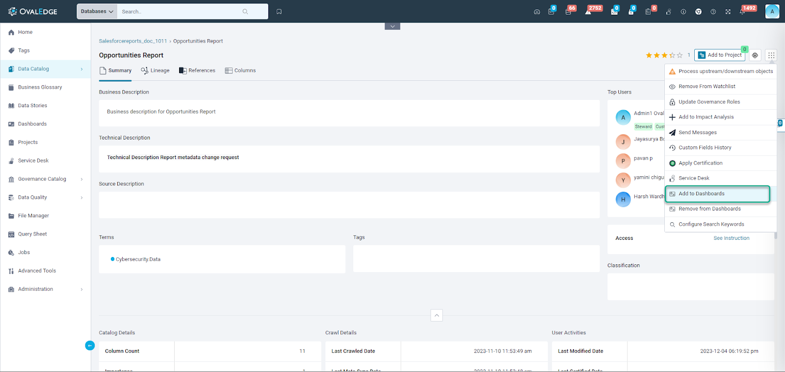
On the summary page of the Data Catalog > Reports, users can employ the intuitive 9 dots functionality. By clicking on these dots, they gain the ability to effortlessly incorporate reports into their custom dashboards, ensuring a streamlined and accessible process.
- Data Catalog > Reports (List View Page)
Similarly, on the list view page of the Data Catalog > Reports, users can leverage the convenience of the 9 dots feature. This provides a consistent and user-friendly approach to integrate reports into their custom dashboards, maintaining a cohesive experience across different catalog views. OvalEdge supports adding bulk report addition to a dashboard through the list view tab in the data catalog.
- Dashboards Page
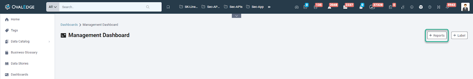
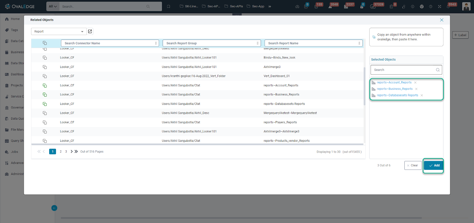
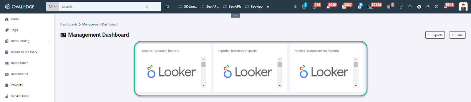
Users have the option to directly add reports to their custom dashboards from the dashboards page.
The inclusion of a dedicated "Add Reports" button streamlines the process, enabling users to quickly select and integrate reports that align with their dashboard objectives.
Note: A maximum of 6 reports can be added to a dashboard at once, providing users with a convenient and efficient way to curate their dashboard content.
Removing Reports from Dashboards
Streamlining dashboard management, users have two convenient methods to remove reports from their custom dashboards:
- Data Catalog > Reports (Summary Page)
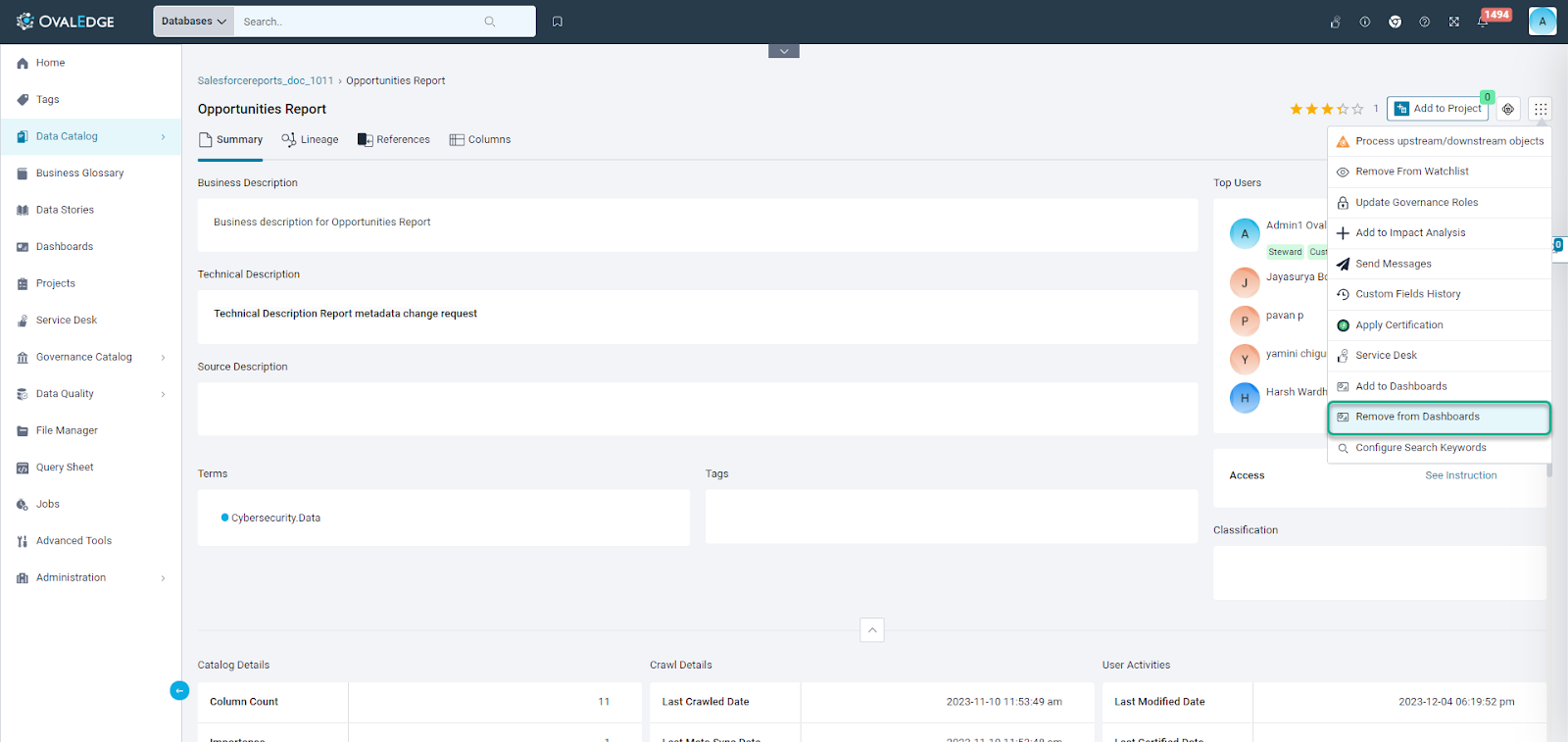
On the Data Catalog summary page, users can efficiently declutter their custom dashboards by utilizing the 9 dots feature. This accessible option allows users to remove reports seamlessly, providing a quick and consistent method to refine the content of their dashboards directly from the Data Catalog summary.
- Dashboards Page
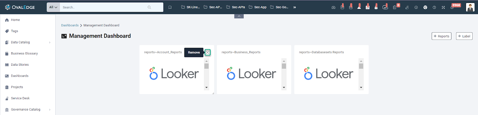
Alternatively, users can simplify the process by removing reports directly from the custom dashboard page. On hovering over the specific report, a prompt action appears, enabling users to remove the report with ease. This straightforward method enhances user control, allowing for instant adjustments to the dashboard content based on evolving needs.
Categorizing Reports in the Dashboards
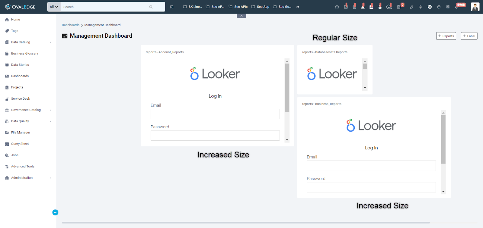
Users can easily adjust the position and size of reports within their dashboards using a simple drag-and-drop interface. The layout is designed to snap to predefined sizes for an optimal user experience. Labels, however, cannot be resized and can only be dragged to different positions.
Managing Labels on Custom Dashboard
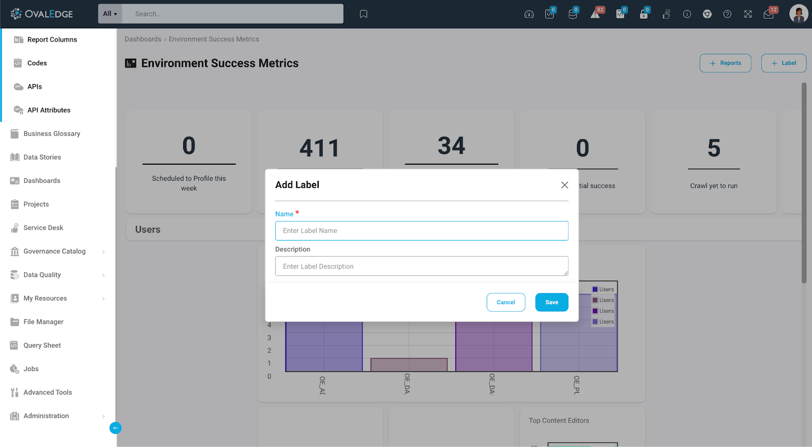
Adding Labels in the Dashboards
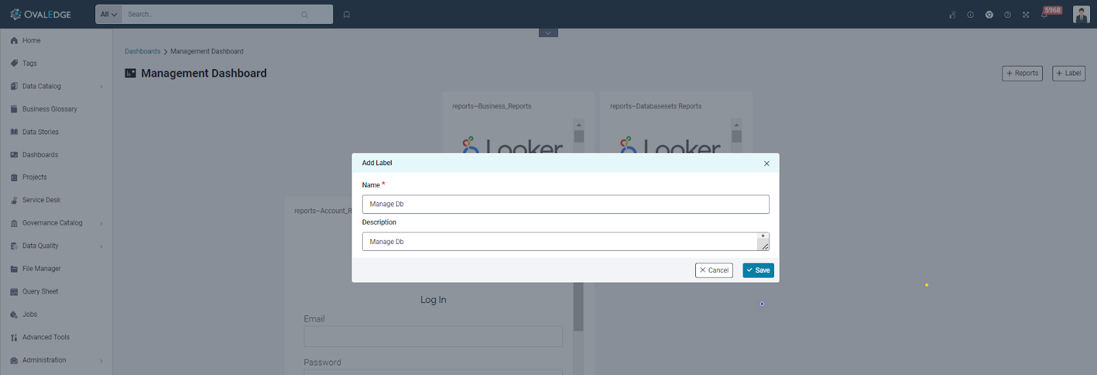
Empowering users with enhanced organization capabilities, the OvalEdge platform allows the addition of labels to custom dashboards. This feature serves as a valuable tool for grouping reports efficiently. Users can create a label by providing a mandatory title and an optional description, tailoring the labeling process to their specific needs.
Once created, these labels offer a dynamic arrangement on the custom dashboard, allowing users to move them vertically. This mobility enables users to strategically position labels and categorize related reports under them. The intuitive drag-and-drop functionality ensures a seamless experience in structuring and organizing dashboard content.
This labeling mechanism not only promotes clarity in dashboard arrangement but also provides users with a flexible and user-friendly means of managing and categorizing reports according to their preferences within our platform.
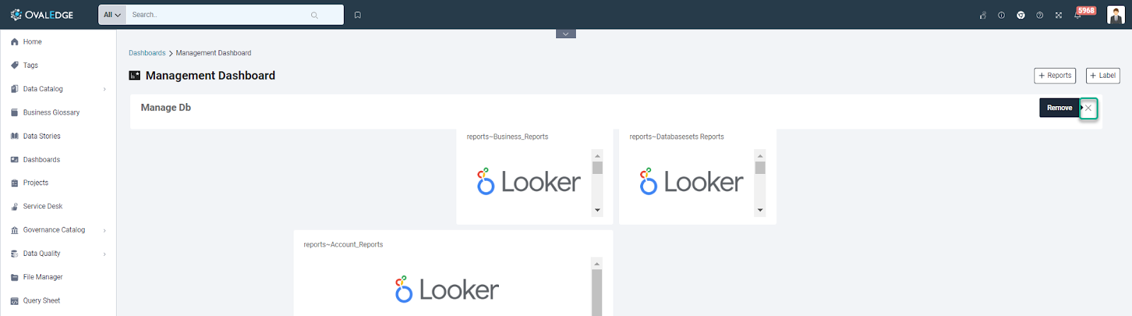
Removing Labels in the Dashboards
The OvalEdge platform allows users to effortlessly manage their custom dashboards by providing a straightforward method for removing labels.
Users can achieve this by hovering over the label they want to remove. Upon hovering, an "x" icon appears, signaling the option to delete the label.
With a click on the "x" icon, users can promptly remove the label from their custom dashboard, streamlining the organization of their reports. This intuitive approach ensures that users have a quick and user-friendly means of adjusting their dashboard layout to meet their evolving needs.
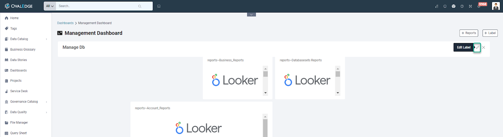
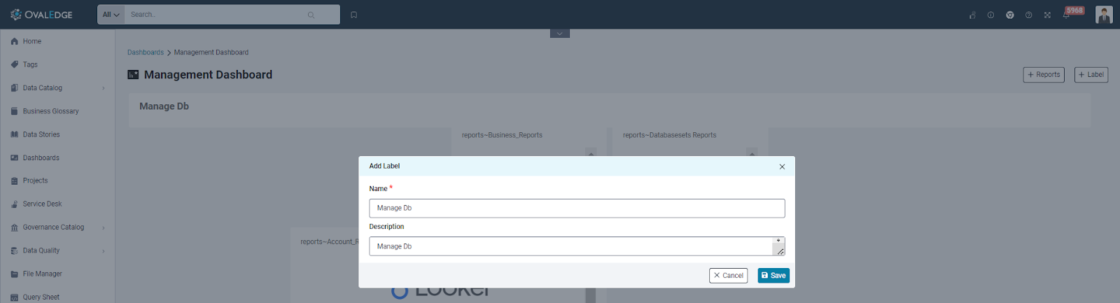
Editing Labels in the Dashboards
The OvalEdge platform empowers users to edit labels within their custom dashboards effortlessly. This can be achieved by a simple hover-and-click action on the desired label, prompting the appearance of a pencil icon.
Upon clicking the pencil icon, a convenient popup emerges, presenting users with the existing title and description of the label. Within this popup, users can seamlessly edit the title and description according to their preferences. This streamlined process allows users to make real-time adjustments to label details, ensuring their custom dashboards align precisely with their evolving needs.
The introduction of the Custom Dashboard is the first step towards empowering users to not only customize dashboards but also create their own reports from scratch in the future. It's your personalized gateway to data management and analytics, tailored to your specific needs.
Favorite Dashboard
The OvalEdge Favorites Dashboard is a dedicated and personalized space for individual users within OvalEdge. This unique type of custom dashboard caters to the specific needs and preferences of each user, offering a seamless experience for managing and organizing data. In terms of functionality, the Favorite Dashboard shares similarities with the process of adding or removing reports, ensuring a user-friendly and consistent experience.
One key distinction is that the favorite Dashboard carries the name of the user corresponding to their OvalEdge user name, making it easily identifiable and linked to the account owner. As the owner of their User's Dashboard, the user has complete control over its content and organization.
When a user account is created in OvalEdge, an automatic favorite Dashboard is generated for that user, regardless of their license type. This dashboard is readily available on the OvalEdge dashboard screen, providing quick access to their personal data management space. Additionally, the favorite dashboard can be managed through the dashboard security feature, allowing users to adjust permissions, control role access, and modify the name and description of their dashboard.
The user's ability to add reports to their User's Dashboard is determined by the accessibility of reports within their account. This flexibility ensures that each user can curate their dashboard with the reports that are most relevant to them, optimizing their data management experience.
Personalization: Users can personalize their dashboards to reflect their unique needs, creating a workspace that resonates with their workflow.
Reports Integration: The dashboard functionality includes the capability to add multiple reports. Users have the flexibility to populate their dashboard with reports that are relevant to their roles or tasks.
Access Control: Users can add reports to their dashboard based on their access permissions. This ensures that individuals only include reports that they are authorized to view or manage.
Labeling System: Users can incorporate labels on their dashboard. This labeling system enables the categorization and easy identification of various reports, contributing to a streamlined user experience.
Pre-Defined Security
|
CASES |
OE_ADMIN |
Author Read-Write Admin |
Author Read-Write Non-Admin |
Author Read-Only Non-Admin |
VIEWER |
|
Dashboard Security |
Y |
Y |
N |
N |
N |
|
Create Dashboard |
Y |
N |
N |
N |
N |
|
Delete Dashboard(s) |
Y |
Y |
N |
N |
N |
|
Metadata Changes on the Dashboard (Tile & Desc) |
Y |
Y |
N |
N |
N |
|
Edit Access |
Y |
Y |
N |
N |
N |
|
Edit Reports/Labels in the Dashboard |
Y |
Y |
Y |
N |
N |
|
Refresh Reports (Data Literacy and Data Quality) |
Y |
N |
N |
N |
N |
|
View Dashboard |
Y |
Y |
Y |
Y |
Y |
|
Favorite Dashboard (All Activities) |
Y |
Y |
Y |
Y |
Y |