A dashboard provides a visual representation of all the data in an application at a glance. It displays multiple charts and important business metrics collectively on a single screen which helps you to drive the business forward.
OvalEdge offers a lightweight visualization feature that allows users to quickly see their data in a graphical form. In OvalEdge, you can visualize your saved queries as basic charts like bar charts, line graphs, area charts, bubble charts, scatter plots, and pie charts. The charts are then published to the OvalEdge timeline dashboard.
The OvalEdge application consists of Data Literacy, Data Quality, Favourite Reports, All Reports, and Data Lineage Dashboards.
Data Literacy Dashboard

OvalEdge provides a simple, and comprehensive Data Literacy dashboard which provides the information graphically on the following:
- Tribal Knowledge Progress - Tables/ Table Columns/ Report/ Report Columns/ File/ File Columns: This provides the count (cumulative) on above-mentioned data objects as per the last updated time using stacked bar graphs.
It gives the total number of crawled data count (in Red Color) and Documented data count (in Green Color) for all the databases.
Note: Documented count displays the number of Data objects having metadata information.
- Number of Terms by Month- This is a stacked bar chart that provided information about the total number of terms created per month and the total number of terms published (cumulative).
- Number of objects for which Terms are applied- This is a bar chart that provides information about the Total number of Terms that are applied to all objects (cumulative) for every month.
- Domain Vs Number of Terms- This is a pie chart that provides the information about all available Domains within the application (You can also see the % of the Domain by hovering on the pie chart) along with the terms count. This also displays no. of terms per domain.
Note: It is required to run the Build Dashboard Stats Advance job, to display the chart on the Data Quality Dashboard.
Data Quality Dashboard
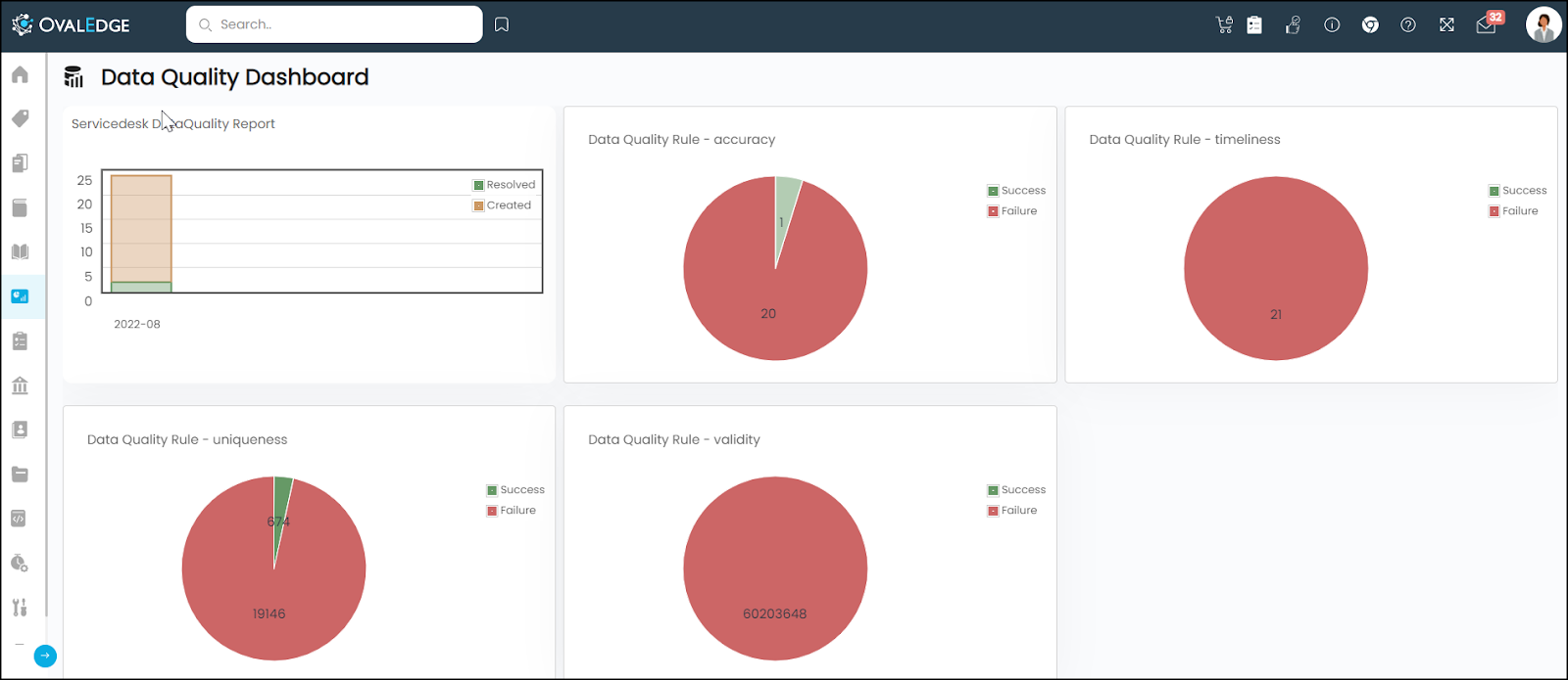
The Data Quality dashboard in the OvalEdge application provides the following graphical information:
- Servicedesk Report: This report displays Data Quality tickets created vs resolver per month. It is a stacked bar chart that contains the last 12 months' report on Created vs Resolved by month.
- Data Quality Rule - Validity: It is a Pie chart that displays the Data Quality Rule (DQR) based on the dimension - validity picturing success and failure percentages.
- Data Quality Rule - Uniqueness: It is a Pie chart that displays the Data Quality Rule (DQR) based on the dimension of uniqueness picturing success and failure percentages.
Similar reports are generated for all standard dimensions of data quality namely - Integrity, Validity, uniqueness, Timeliness, Accuracy, Completeness, Conformity, and Consistency.
Note: It is required to create and run a Data Quality Rule to get the pie chart on the Data Quality Dashboard. In case of failure of the Data Quality rule, it results in the graph on the Dashboard.
If you are running multiple rules with one dimension, the overall success or failure result will be displayed on one pie chart.
Note: To get the latest Servicedesk Data Quality Report, you need to run the Build Dashboard Stats Advanced Job in the Administration > Advanced Job.
Rules for generating Data Quality Dashboard
The following table describes the rules, which will result in the graph if the rule gets failed.
|
Rules |
Description |
|
NULL COUNT(TC) |
Returns TRUE if the count of null values falls in the range; else FALSE and gets the stats and the first50 failed values |
|
VALIDATE EMAIL PERCENT(TC) |
Returns TRUE if the format of the elements in the column is “%_@_%. _%”, else FALSE and Executes the stats and values code |
|
VALIDATE REGEX PERCENT(TC) |
Returns TRUE if the defined REGEX matches with the column values; else FALSE and Executes the stats and values code |
|
VALIDATE PATTERN PERCENT(TC) |
Returns TRUE if the defined pattern (U, L, D or combination of any) matches with the column pattern; else FALSE and Executes the stats and values code |
|
OUTLIER RULE(TC) |
User-provided values for low & high range values should be between the table's min and max column. If low or high values are not in that column's minimum and max range, rule execution status will fail and show the statistics. |
|
IS_UNIQUE_COLUMN(TC) |
select case when (count($COLUMN) - count(DISTINCT $COLUMN)) > 0 then 0 else 1 end as uniquecolumncount from $TABLE where $COLUMN is not null |
For other DQR rules, it will display the success and failure range in one pie chart based on dimensions.
The various dimensions considered at the time of generating the Data Quality Report are as follows:
|
Dimensions |
Description |
|
Accuracy |
Data must be accurate and truthful in representing the real-life entity |
|
Completeness |
Data should be assigned a value (means the completeness of its object record) |
|
Consistency |
Data values in one data set are consistent with values in another data set |
|
Integrity |
All intended references from data in one column of a table to data in another column of the same or different table is valid |
|
Timeliness |
Time expectation for accessibility and availability of information |
|
Uniqueness |
No entity exists more than once within the data set |
|
Conformity |
Following the set of standard data definitions like data type, size, and format |
|
Validity |
This dimension allows you to run the query within the defined values ranges. |
Favourite Reports Dashboard
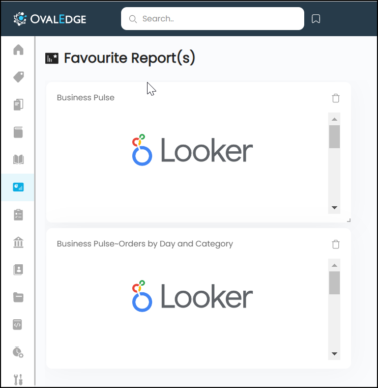
The Favourite Reports Dashboard in the OvalEdge application allows you to save important or frequently used dashboards in personal space for quick access using the ADD TO FAVOURITE.
You can add a report to the Favourite window from the Dashboard > All Reports window.
To add a report to a favorite:
- Go to Dashboard > All Reports, which will display the All Reports dashboard will all the reports available in the application.
- Click on the star icon available in the right corner of the report you want to add to your favorite. The report you have added will appear on the Dashboard > favorite reports dashboard page.
You can also add a report to the Favourite from Data Catalog > Report > Report Summary > Nine Dots > Add to Favourites.
You can remove the report from the Favourite window by clicking on the delete icon available in the top right corner of the report you want to remove.
All Reports Dashboard
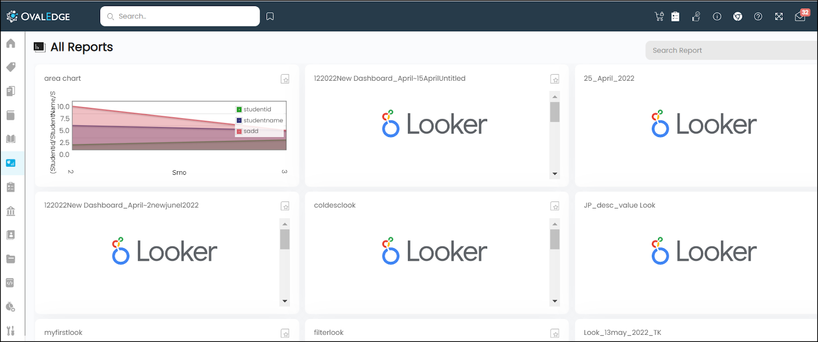
Whenever a report connection is crawled from the source systems (Tableau, Power BI, etc) and also when a report is created using the queries within OvalEdge have populated on the Dashboard > All Reports page.
In case of the addition of a new report manually in the application, it will be displayed on the All Reports Dashboard page.
Note: For the report type Power BI Dataset and Tableau Datasource the reports will not be shown on the all reports dashboard page.
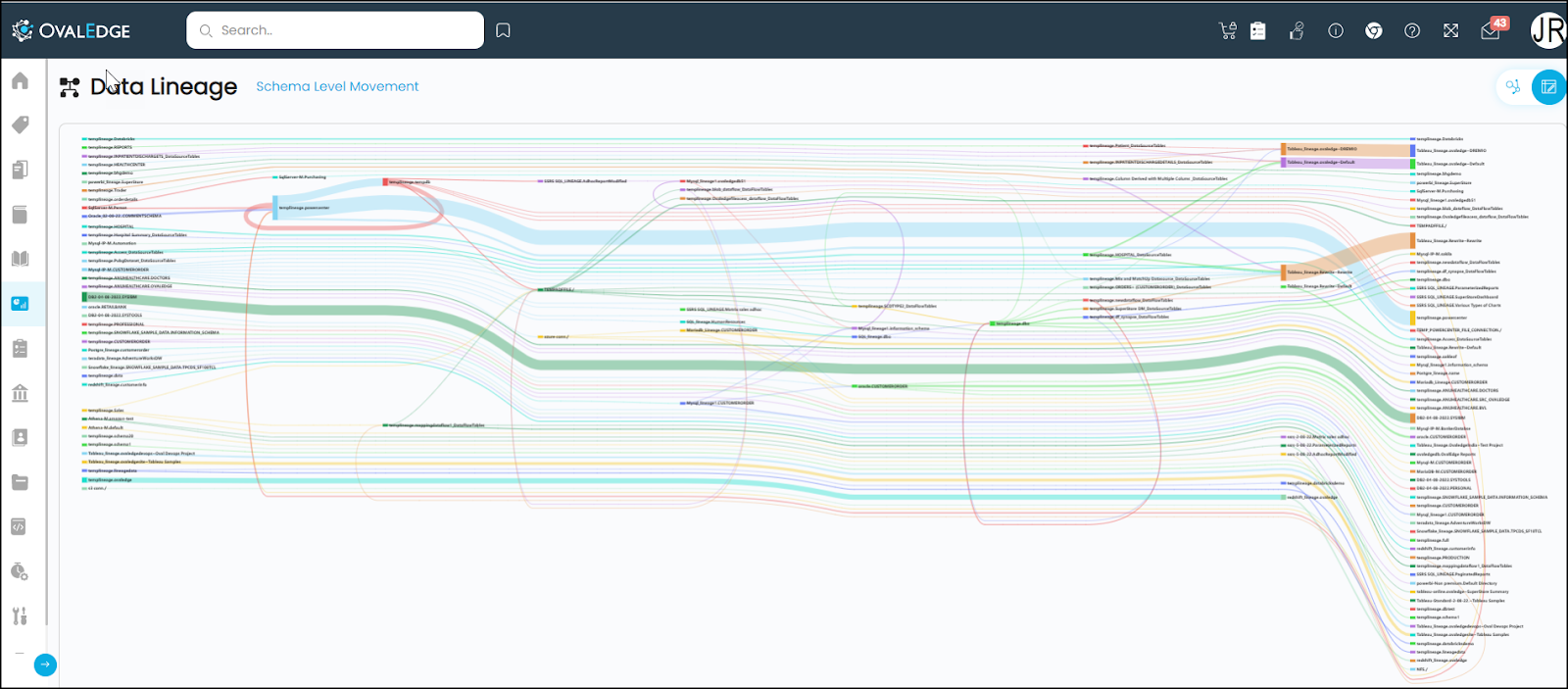
Data Lineage Dashboard
In the OvalEdge the Lineage Graph provides a clutter-free view. The Data Lineage Dashboard provides business users to visualize the end-to-end flow of data from a source to a destination for all the data connections in OvalEdge. With this interactive visualization (Sankey Chart), you can see the data movement from one point to another. The connected data objects are called nodes and the data flow between them is called links. The width of each link is proportional to the quantity represented.
You can click on any node in the chart to see how the data flows between the schemas, tables, and columns. On the left side (upstream), is a list of all the source data objects and on the right side (downstream), is the list of all the destination data objects.
Building Data Lineage
To view the Data Object on the Data Lineage Dashboard, it is necessary to build the lineage manually or by the Auto Lineage Process between the source and destination data objects.
First, you need to connect and crawl all the data sources that are in the form of databases, files, and reports that have the data movement, for building the lineage, which can be viewed on the Data Lineage Dashboard.
The information about data and statistics is available in the OvalEdge data catalog. Understanding the metadata, relationships, and data lineage, users can create, validate, users, to edit and update the lineage for tables, files, reports, columns, file columns, and report columns. With the help of human curation, users from different groups can create and adjust the lineage for both source (upstream) and the target (downstream) data objects.
OvalEdge uses source code parsing algorithms to parse various kinds of source code to build the lineage and relationships automatically. OvalEdge currently supports building lineage from the following:
SQL Query Logs: When a user executes a query on the database, OvalEdge can crawl these queries and parse them to find the source and destination.
Source Code Parsing: PL/SQL(Oracle), T-SQL (SQL Server), and Teradata SQL sources can be parsed by OvalEdge to find the lineage.
Reporting/Visualization Tools: OvalEdge supports building lineage from visualization tools like Tableau, QlikView, Qlik Sense, SAP Business Objects, Crystal Reports, and Power BI.
Representation of Data Lineage Dashboard
The Data Lineage Dashboard represents the Data movement for Schema Level, Table Level, and Column Level. You can view the Schema Level Data movement in the Flow View, and all the three types of Data movement in the Sankey View.
Schema Level: The highest level of data movement is from a source schema to a destination schema. Hovering over the schema (either at the source or destination) will highlight the data flow between the schemas. Furthermore, users can see the count of tables at each node. The width of each line on this page displays the number of tables from which data is flowing from source to destination.
Note: The wider the line, the more tables are involved in the data flow.
Table Level: The next level of data movement is at a table level. When users click on a certain schema, they can see the data movement of specific tables within that schema. The left side of this chart displays the table names in the source schema and the right side displays the table names in the destination schema. Hovering over the table names in the source schema displays the count of tables in the destination and vice versa.
Column Level: The lowest level of data movement is at the column level. When users click on a certain table, they can see the data movement of specific columns within that table. The left side of this chart displays the column names in the source table and the right side displays the column names in the destination table. Hovering over the column names in the source table displays the count of tables in the destination and vice versa.
The Data Lineage Dashboard can be viewed in ways:
- Flow View
- Sankey View
Flow View

The Flow View represents the connection level/ Schema level Data movement (Data Flow from one schema to another schema) in the OvalEdge application.
Sankey View
Sankey diagrams are flow diagrams in which the width of the arrows is proportional to the flow rate. Sankey Diagrams are a way of visualizing the relationship or flow of the data among the objects.
In the OvalEdge application, the multi-level horizontal Sankey Diagram is used to provide you an overall idea of the relationship among the objects at a higher level and the ability to trace a single object through the flow. You can view the complete lineage flow of the data assets (Data objects). Using a specific node or link, you can further navigate from the schema level to the table level and column level (Clicking on the Schema level node or link navigates you to the Table level, and clicking on the Table level link or node takes you to the Column level).
Every detailed object has its separate flow highlighted in different colors. The width of the lines shows the magnitude of information; the more significant the width of flow, the larger the quantity of flow.
You can navigate to the Sankey View through the Dashboard > Data Lineage > Sankey View icon.
You can zoom in and zoom out in the lineage diagram to have closure and clear visuals. Additionally, the diagram is enhanced with draggable nodes, i.e., you can drag the nodes as per your convenience for a better understanding of the links.
Example: To view lineage for the table Copydata_SP
- Navigate to Data Catalog > Table.
- Search the table name on the Search bar available on the Table Name column and click on the Table name.
- Go to the Lineage tab to view the Lineage. In the Lineage Diagram, you can view the data movement along with the source and destination objects for the table Copydata_SP.

- You can view the same lineage in the Sankey view as well.
The Schema level Data movement for the teradata_lineage Schema (the associate schema for the table Copydata_SP) is shown below.
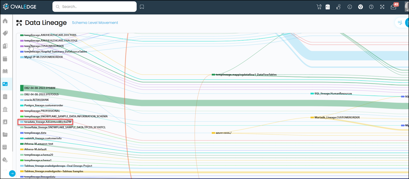
You can click on the node or the connecting line to view the Table Level Movement.

As per the above image, the data is moving from Copydata_SP table to Copydata_view table, which is the same as the data movement viewed on the Data Catalog > Summary > Lineage Tab.
You can click on the node to view the Column Level Movement.

Copyright © 2019, OvalEdge LLC, Peachtree Corners GA USA